Threatbase™
Threatbase was designed to allow analysts at Booz to track hackers, attack types, etc. in order to create Reports that would then be shared with customers.
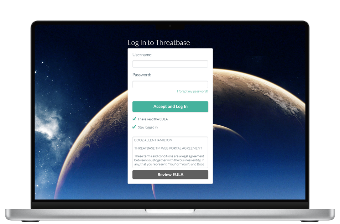
Threatbase is a suite of powerful tools, each of which came with its own exciting design challenges and solutions, but this article is primarily focused on the User Dashboard and individual Reports pages. This is because I personally found these pages allowed the most room for innovation and design thinking.
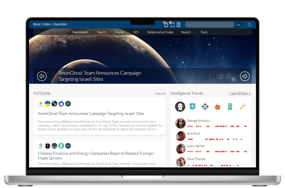
The analysts at Booz needed to be able to easily search a wide variety of information about cyber threats around the world, but for the end customer the Reports themselves were the most important things in the application by far. With this fact in mind, we decided to take a very type-centric approach to the Reports, knowing that they needed to be extremely legible and inviting to encourage people to actually read the sometimes dry information contained within. We drew inspiration primarily from blogging platforms like Medium and from contemporary news sites like Quartz and Vox.
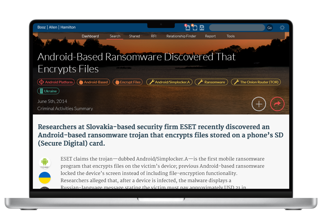
We tried to focus on strong typography, choosing contrasting fonts to create a rigid hierarchy of information and using clean, modern web fonts to communicate that this is a cutting-edge application with up-to-the-minute information to protect your business. A clean sans-serif with a tall x-height was chosen for most of the interface, paired with a very legible serif for the body text of the Reports.
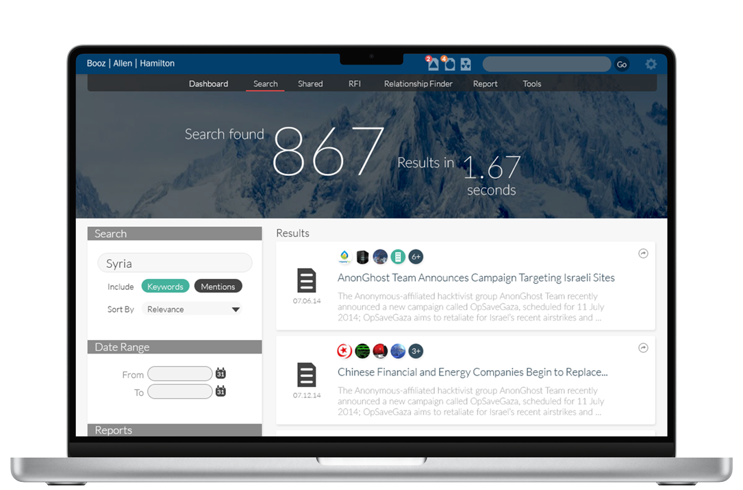
We were able to be pretty loose with Booz Allen's corporate branding guidelines. We needed colors to indicate different types of information and statuses, and the corporate guidelines just weren't designed with that type of requirement in mind. We chose a few bright, attention-grabbing colors for this purpose, but otherwise let the typography be the central design element. These colors were then paired with icons to denote the various object types throughout the system.
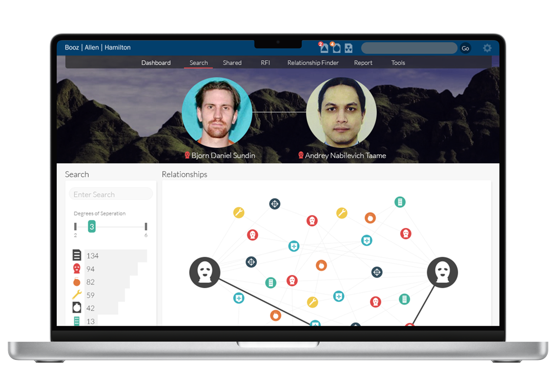
In the parts of the application which were used by Booz analysts we had completely different focuses. The analysts would be using the application every day and were essentially power users. We nixed the large type for them but made sure to maintain a strong information hierarchy. Legibility was still very important, but now information density and extremely usable controls were a greater concern.